Common Wedding Website Mistakes (and How to Avoid Them)
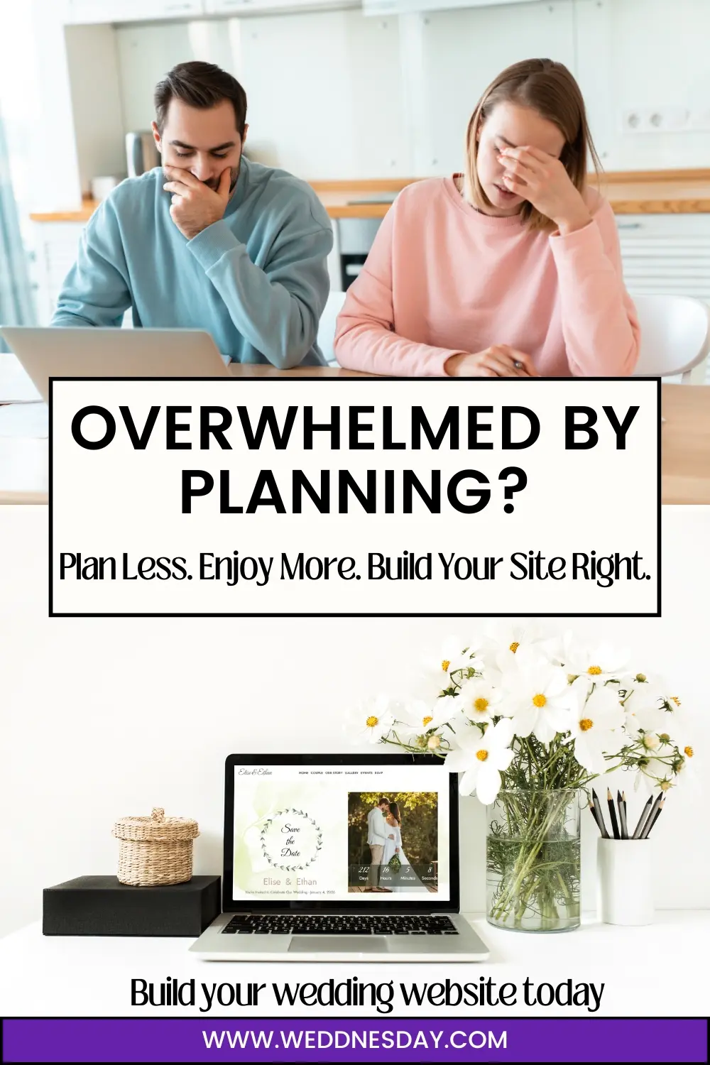
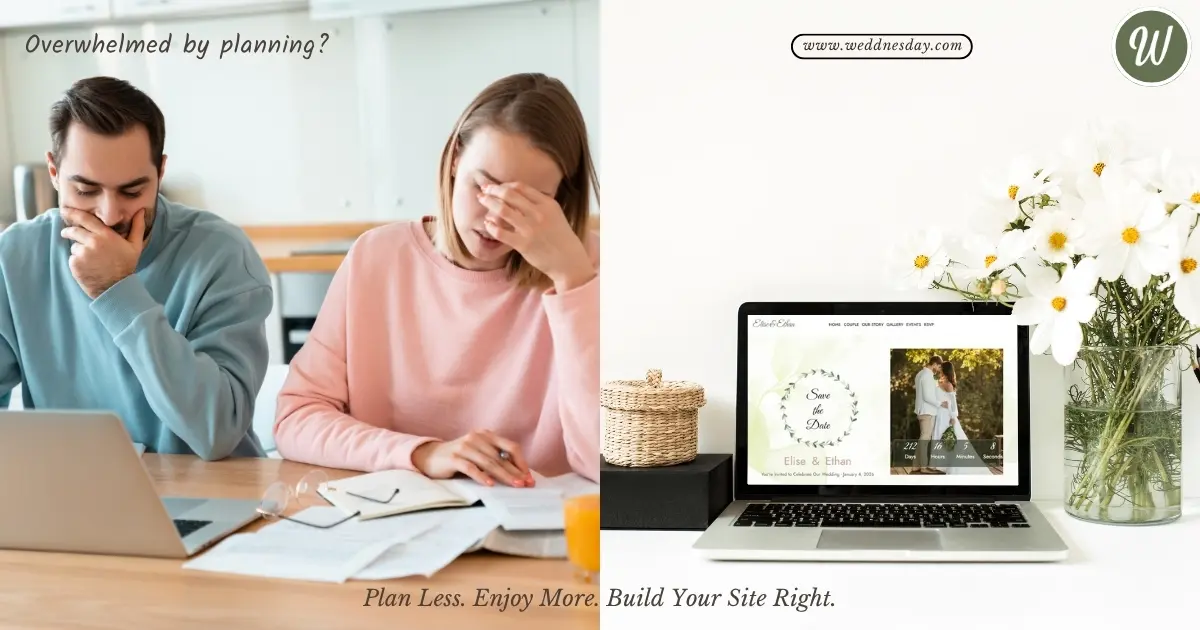
Planning your wedding already feels like juggling a million moving parts — from vendors to guest lists to last-minute changes. And somewhere in that whirlwind, your wedding website can quietly become an unexpected source of stress… or a smooth, beautiful centerpiece for your day.
We’ve seen both sides.
At Weddnesday, we talk to couples all the time who thought a wedding website would be “just one more task” — only to realize how much easier it made everything once it was done right. And we’ve seen the common mistakes couples make (through no fault of their own), simply because most platforms weren’t built with real wedding timelines, real guests, or real humans in mind.
Let’s change that.
Here are the most common wedding website pitfalls — and how to skip them entirely.
Treating Your Website Like a Last-Minute Add-On
Many couples treat the website like a formality — something to slap together once the invitations are out. But here’s the truth: your website is your wedding communication hub.
Your guests will visit it before the ceremony, after they RSVP, the night before the reception… and probably on the way to the venue.
The sooner you set up your website, the easier everything becomes. You don’t need all your final details on day one. Start small, update as you go. Even just a date, location, and RSVP form is enough to give your guests a helpful starting point.
👉 Ready to start building? Browse all templates and find your perfect match:
https://weddnesday.com/templates
Overloading the Homepage
We get it — you’re excited! You want to share everything. But cramming your entire wedding vision onto one scrolling page can overwhelm your guests (and hide the important stuff).
Your homepage should be a warm welcome — a photo, a quick intro, and a clear next step. Keep your story, travel tips, and FAQ in separate sections. Let your guests move through your site like they would a conversation — not a checklist.
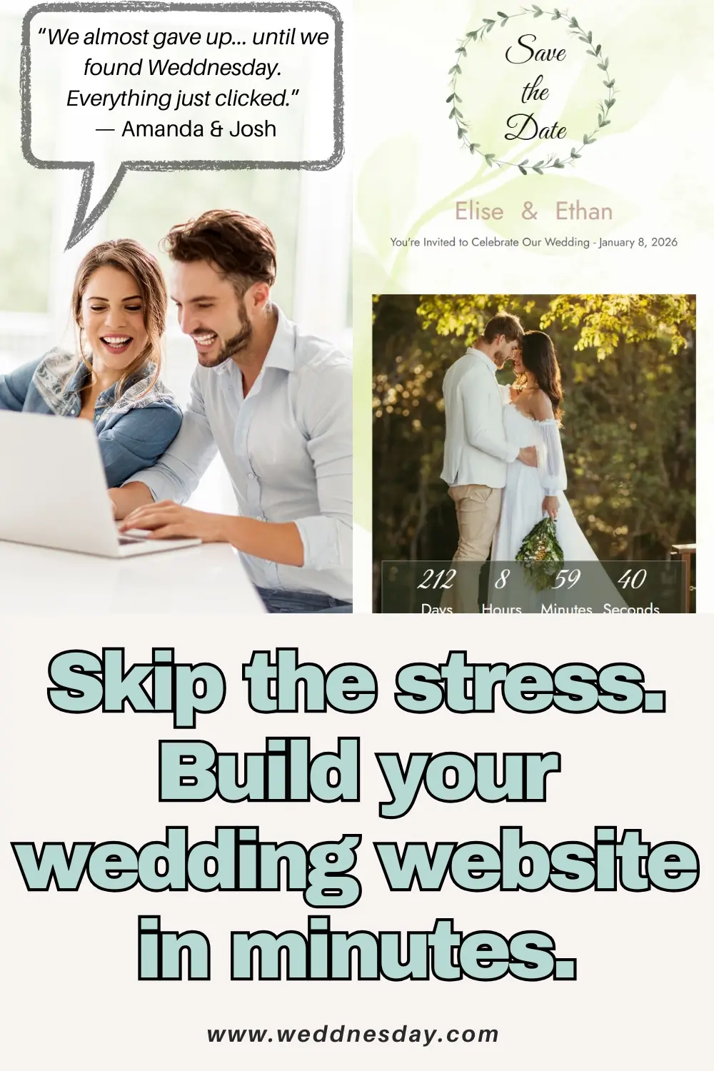
Every Weddnesday template, like the new Elise template, is designed to keep things clean, readable, and inviting — while still letting you customize every detail.
Forgetting Mobile Users
Over half your guests will view your website on their phone. Standing in line. At the airport. Or pulling it up while texting you a random question.
If your site isn’t mobile-friendly, you risk misaligned images, cut-off text, or RSVP forms that don’t quite work.
That’s why all Weddnesday templates are mobile-first. Whether it’s the sleek “Alice” or the elegant “Elise,” your site will look perfect on every screen — with zero tweaking.
Making the RSVP Process Too Complicated
If you’re still collecting RSVPs through Google Forms or text messages, we get it — you’re just trying to keep things simple. But it almost always leads to stress.
With Weddnesday, RSVP is built in — no extra tools, no setup. Guests fill it out right on your site. You can collect meal preferences, song requests, even plus-one names.
And when it’s time to send the final list to your caterer? Export everything to PDF or CSV in a click. No copy-pasting. No second-guessing.
👉 Want to see RSVP in action? Try the Elise template today:
https://weddnesday.com/templates/elise
Forgetting to Add Personality
Your wedding website shouldn’t look like a generic template. It should feel like you — your story, your style, your voice.
Add your favorite photo. Write a short note to your guests. Share how you met or what you’re most excited for. The little things matter.
That’s why every section in Weddnesday is editable — text, images, even the menu names. And one of the biggest advantages? You can write everything in your own language. Whether it’s English, Spanish, German, Romanian, or anything else — your site can reflect your culture, your voice, and your guests' comfort.
And the best part? You can do it all without signing up. Just pick a template and start editing.
👉 Try it now — no login required:
https://weddnesday.com/templates
Bonus Mistake: Trying to Do It All at Once
You don’t need to launch the perfect website on day one. Start small — names, date, RSVP. Add your story later. Then the gallery. Then maybe the travel tips.
Weddnesday was designed to grow with you. No pressure. Just progress.
Conclusion: Mistakes Are Normal — But Avoidable
At the end of the day, your wedding website is more than a link. It’s how you invite. How you inform. How you connect with your guests without drowning in texts, paper, or spreadsheets.
With Weddnesday, you get a site that looks beautiful, works seamlessly, and is actually enjoyable to build.
👉 Explore all wedding website templates:
https://weddnesday.com/templates
👉 Or start designing your dream site with Elise:
https://weddnesday.com/templates/elise
💾 Share or Save This for Later
Want help deciding what to actually include on your wedding website? We’ve got you covered.
📖 Read: What to Include on Your Wedding Website in 2025
📌 Save the Pinterest Pin
Save This on Pinterest